


Aims to strike a balance between introspective obsession with aesthetics, materials, fabrication techniques and active engagement with human & socio-cultural context of design. What could be better and design all things possible in our realm that could make a difference.


Design Director: Siam Attariya
Designer: Teerapat Lowsuwannawong, Tham Bannakarn, Paputh Nim


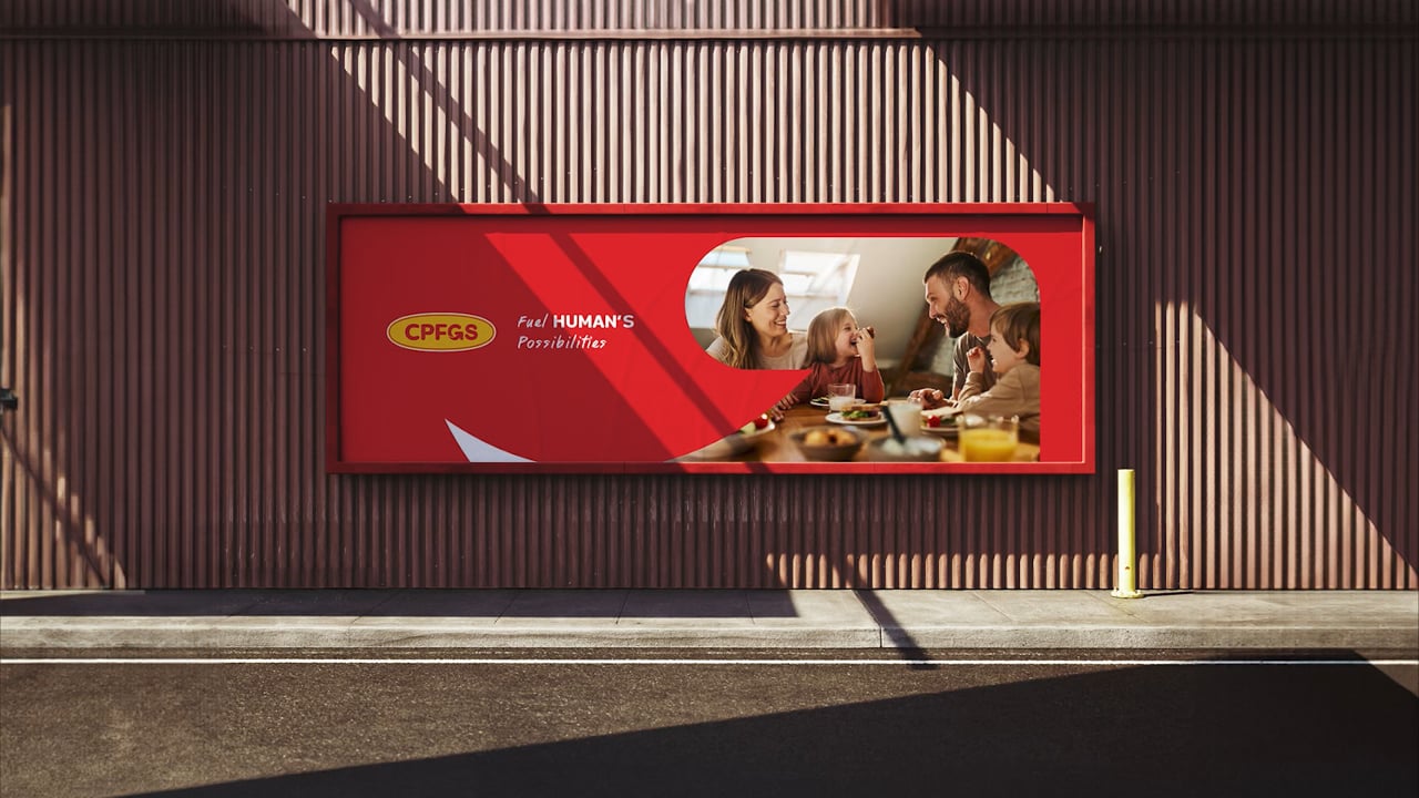

Craft a new visual identity, building upon the established logo foundation. Develop the application of this logo and the overall visual identity for CPFGS, a subsidiary of CPF. Provider of integrated food solutions committed to uplifting everyone's health by driving the food transition to preventive healthcare.

Visual identity for CPFGS
Good food equals good investment for a healthy life. Global food solutions transform everyday food into delicious and nutritious options that empower you to take charge of your well-being.

Design Director: Siam Attariya


Design Director: Siam Attariya


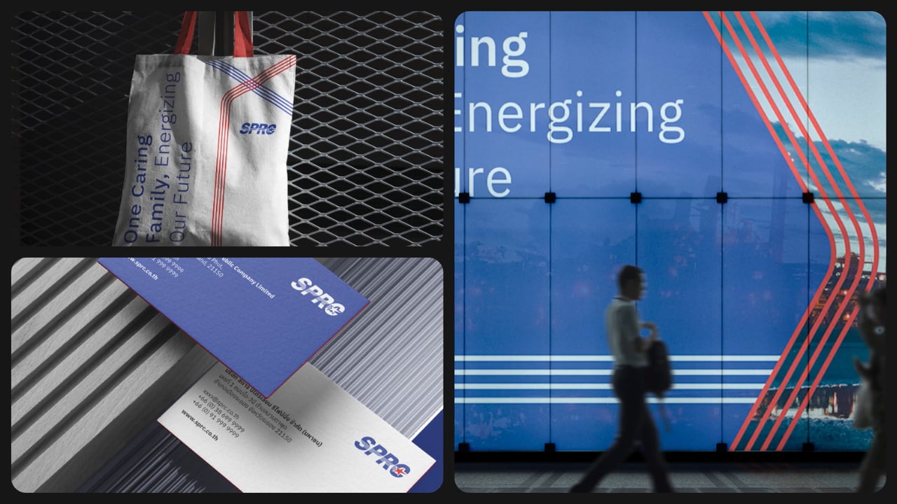
SPRC Brand Center / 2024
Pink Blue Black & Orange for SPRC

Experience the New SPRC with Ease!

Design Director: Siam Attariya


TCT / 2021
Branding
Pink Blue Black & Orange for TC Agrotrading

TCT is a distributor of food and Beverage in Southeast Asia (SEA). Based in Hong Kong. And also offer spaces for retails or offices in Hong Kong (HK).
Provide society with premium quality products. Connecting market and possibilities. Strong long-term relationship with partners. To help people excelling in their daily activities going beyond limits.


Client: TC Agrotrading
Design: Pink Blue Black & Orange
Design Director: Siam Attariya
Designer: Paputh Nimchuar / Pornchanit Visitchaichan / Teerapat Lowsuwannawong


Busy Bees / 2020
Brand Identity
Store Design by Studio Aeroplane


Client: Beehive Buns Bakery
Store Design: Studio Aeroplane
Design: Pink Blue Black & Orange
Design Director: Siam Attariya
Designer & Illustrator: Paputh Nimchuar / Pornchanit Visitchaichan / Parima Juthakorn


Beehive Buns Bakery / 2014
Brand Identity


Standard logo manual
Collaborate with Anon Pairot design studio


Corporate & Brand Identity, Packaging design


Corporate & Brand Identity
Collaboration project with Anon Pairot design studio for DITP (Department of International Trade Promotion, Ministry of Commerce)


Corporate Identity, Standard logo manual
Industrial design, Faculty of Architecture. King Mongkut's Institute of Technology Ladkrabang


